If you are someone who has been going online trying to learn more about the current pandemic or a county official trying to decide whether or not to lock down your county, odds are you’ve come across at least one or two COVID-19 dashboards. They can include a number of interesting features from interactive maps and visuals which show where the virus has spread, to numbers on various health and business-related sub-indicators which attempt to help you make decisions related to the ‘new normal’ we find ourselves in.
Not all dashboards are created equal – some present unique data, some are more user-friendly to navigate, and some are easier on the eyes aesthetically.
The aim of this blog post is to present 10 of the better ones we have seen, and to discuss the pros and cons of each. Oh, and of course we also present the url for each in case you want to check them out for yourself.
Here’s a couple of quick points to note:
- The dashboards we are reviewing are more focused on those that can help decision makers figure out how to handle the economic reopening of their counties.
- This is hardly an exhaustive list, and it seems as if more dashboards are popping up with each passing hour! However, it should give you a good idea of what is out there, so you can bookmark the ones you like the best.
So, without further ado, here we go…
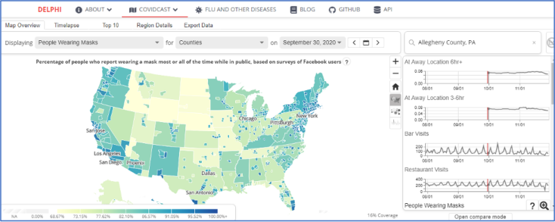
#10 – Carnegie Mellon University COVIDcast
The Carnegie Mellon University (“CMU”) COVIDcast website displays signals related to COVID-19 activity levels across the United States, derived from a variety of anonymized, aggregated data sources made available by multiple partners.
Each signal may reflect the prevalence of COVID-19 infection, mild symptoms, or more severe disease over time. Each signal can be presented at multiple geographic resolutions: state, county, and/or metropolitan area. All these signals taken together may suggest heightened or rising COVID-19 activity in specific locations.
CMU specifically states on the site that the content of the COVIDcast site and Epidata API are provided on an AS-IS, AS-AVAILABLE basis and are not intended for diagnostic or treatment purposes, or for guidance on any type of travel.
Pros
- User-friendly map makes for a visually attractive interface
- Has data at county level
- Ability to select from 3 types of indicators (public’s behavior, early indicators and late indicators)
- Graphs for each indicator are displayed on the right so you can see trends over time
Cons
- No overall scores, ratings, or risk levels
- No recommendations are given
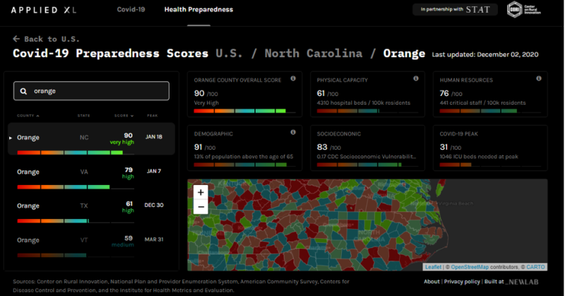
#9 – Applied XL COVID Preparedness
https://health.appliedxl.com/preparedness
This dashboard uses a host of factors – everything from the relative age of the population to the number of nearby hospital beds and staff – to determine which counties are best prepared for an outbreak and which might need more help.
Pros
- Visually appealing and intuitive user interface
- Able to select down to the county level
- Sub-indicators are well presented and easy to understand
Cons
- Limited number of sub-indicators
- No recommendations presented
- No overall score per county
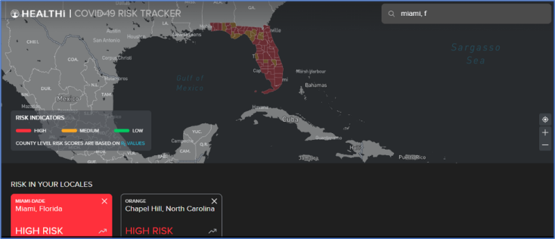
#8 – Tresata HEALTHi COVID-19 RISK TRACKER
https://healthi.tresata.com/search-risk
Launched by Charlotte, NC-based data analytics company, Tresata, this app combs through public data and compiles information to determine risk at a county-by-county level. It then assigns a risk score which represents the average number of people who are infected by a person who is already infected at a given time. For example, Orange County is currently deemed a high risk at 1.1.
Pros
- Contains all counties within the United States and the searchable function is nice
- Map is user friendly, easy to understand and you are able to Zoom In/Out
Cons
- Limited to only two metrics – Rt value (the effective reproduction rate of the virus calculated for each locale) and the “Tresata Recovery Index” (TRI (0-10) represents the velocity at which COVID-19 is spreading in each US county. Lower values indicate greater recovery.
- No recommendations
- Pretty limited in scope
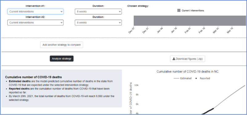
#7 – COVID-19 Simulator from Mass General/Harvard Medical School
The COVID-19 Simulator website has a collection of tools to help health policymakers and practitioners make decisions regarding policy and strategy related to coronavirus disease. It consists of four dashboards: a COVID-19 Policy Simulator, a COVID-19 Outbreak Tool, a COVID-19 Football Tracker (yes, you read that right, it presents NFL/NCAA game-related info and outbreak data), and a COVID-19 Seroprevalance (proportion of the population with antibodies to COVID-19 by state). We will focus on the policy simulator (although you may want to check out the other tools as they are pretty cool as well).
It allows you to choose between 4 types of high-level interventions (current interventions, minimal restrictions, stay-at-home-orders, and lockdown). You then choose a duration between one week and 16 weeks and it simulates the impact on Cumulative number of COVID-19 deaths, Number of new COVID-19 deaths each day, Cumulative number of diagnosed COVID-19 cases, Cumulative number of COVID-19 cases (diagnosed and undiagnosed), Number of new COVID-19 cases diagnosed each day, Number of new COVID-19 cases each day (diagnosed and undiagnosed), Number of active COVID-19 cases, Number of hospital beds needed for COVID-19, Number of ICU beds needed for COVID-19).
Pros
- Simple to use interface is easy to understand
- Output in graphs below is also intuitive
- Nice explanation on how the simulator works
- Can predict up to 4 months in the future
Cons
- No county-level data
- All indicators are related to health, nothing related to business/economy
- Limited number of indicators
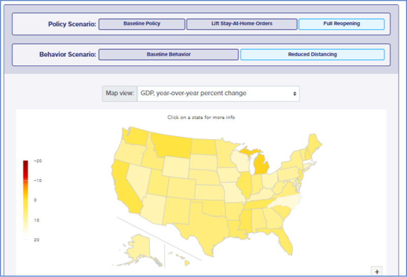
#6 – Coronavirus Policy Response Simulator: Health and Economic Effects of State Reopenings – Penn Wharton
https://budgetmodel.wharton.upenn.edu/issues/2020/5/1/coronavirus-reopening-simulator
Using an integrated, interdisciplinary modeling approach, this simulator forecasts the state-level health and economic effects of reopening businesses and relaxing stay-at-home orders. This simulator was last updated on June 23, 2020. The interactive tool they created uses an epidemiological framework along with empirical estimates to simulate the health and economic effects of easing state lockdown policies. Users specify both a “policy” level and “behavior” level, four types of outcomes are then simulated: cases, deaths, GDP, and employment.
Pros
- Easy to understand and navigate
- Excellent explanation and FAQs to ensure you understand how it works
Cons
- No county-level data
- Limited number of policy and behavior scenarios
- Limited number of outcomes
- No recommendations given

#5 – TIBCO COVID-19 Live Report
Information on the Coronavirus pandemic is changing in real time. To support worldwide communities in managing the effects of the virus, TIBCO set up this information hub, including live interactive visual data science analyses, as well as blogs and partner contributions. Their goal is to understand community outbreaks and healthcare resources in real time and assess the local effects of non-pharmaceutical interventions.
While TIBCO had several cool dashboards, we were most interested in their Business Reopening Evaluation:
Pros
- The interface is nice overall, letting the user choose the state and specific metric is pretty cool
- Has both state and county-level detail
- Easy to understand and navigate
Cons
- Only 7 county level metrics and 3 statewide metrics
- No recommendations offered
#4 – COVID-19 Decision Support Dashboard
The COVID-19 Healthcare Coalition is a collaborative private-industry response to novel coronavirus. Their mission is to save lives by providing real-time learning to preserve healthcare delivery and protect people and support decision makers during the pandemic.
Pros
- You are able to customize the dashboard by adding specific states
- User interface is simple and easy to understand
Cons
- No rolled-up risk scores for states or counties
- Recommendations are limited
- Business and economic indicators are limited
- Map of USA is not aesthetically pleasing
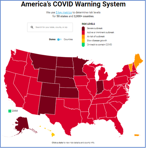
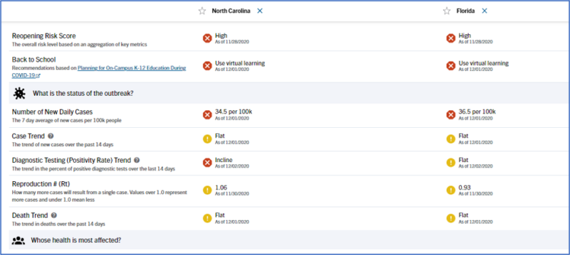
#3 – COVID Act Now
https://covidactnow.org/?s=1388369
COVID Act Now uses five key metrics (daily new cases, infection rate, positive test rate, ICU headroom used, tracers hired) to determine risk levels for 50 states and 3,000+ counties.
Pros
- Interactive map and risk levels are easy to navigate and understand
- Has both data and recommendations for all states and counties
- Red/yellow/green color scale is intuitive
Cons
- Risk score is calculated using only five risk factors
- Recommendations are relatively basic
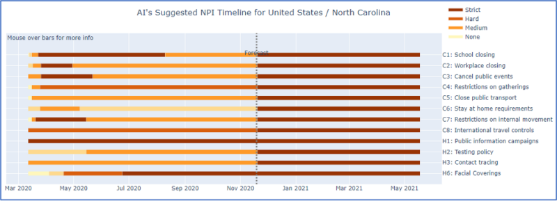
#2 – Evolutionary AI Dashboard
https://evolution.ml/demos/npidashboard/
This demo illustrates recommendations (NPIs) that Evolutionary AI generates for different countries at different stages of the pandemic. You first select the country from the map on the right, and then select the degree to which you would like to minimize the number of cases vs. minimize the stringency of NPIs from the slider on the left. Among the ~101,240 possible NPI schedules for the next 180 days, the AI will then recommend one that implements that tradeoff with as few cases and NPIs as possible. The predicted number of cases and the recommended NPIs are also shown over time in the charts below.
Pros
- Suggests interventions based on whether you are more concerned with minimizing COVID cases or minimizing the number of non-pharmaceutical interventions you make
- Provides data on most countries as well as states within the United States
- Recommendation graphic is easy to understand and customizable based on what you are trying to accomplish
- Summary of suggested intervention at bottom of page is useful
Cons
- No county-level data
- No Help system
- Not sure what the graph on the top right is as it is empty
- Recommendations cannot be taken literally (they say on their website: “Given the amount and quality of available data, these recommendations should not yet be taken literally, but it is possible to see certain informative trends to emerge: for example schools and workplace restrictions, i.e. those where people spend a lot of time with the same people mostly indoors, have the largest impact. Also, the model suggests that there may be creative ways to implement these restrictions gradually, for instance by alternating them on and off over time. These insights also change depending on the stage in the pandemic.”)
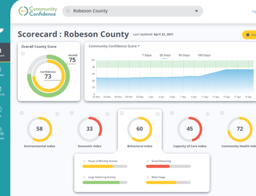
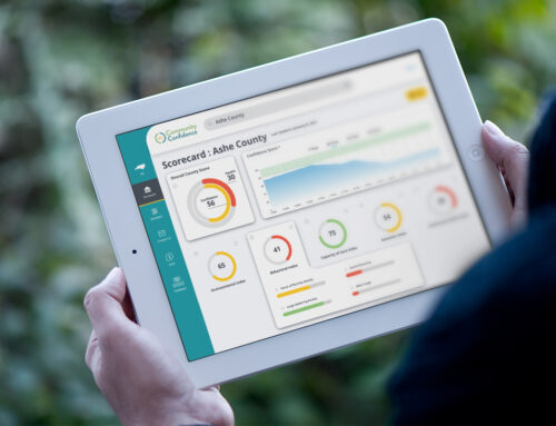
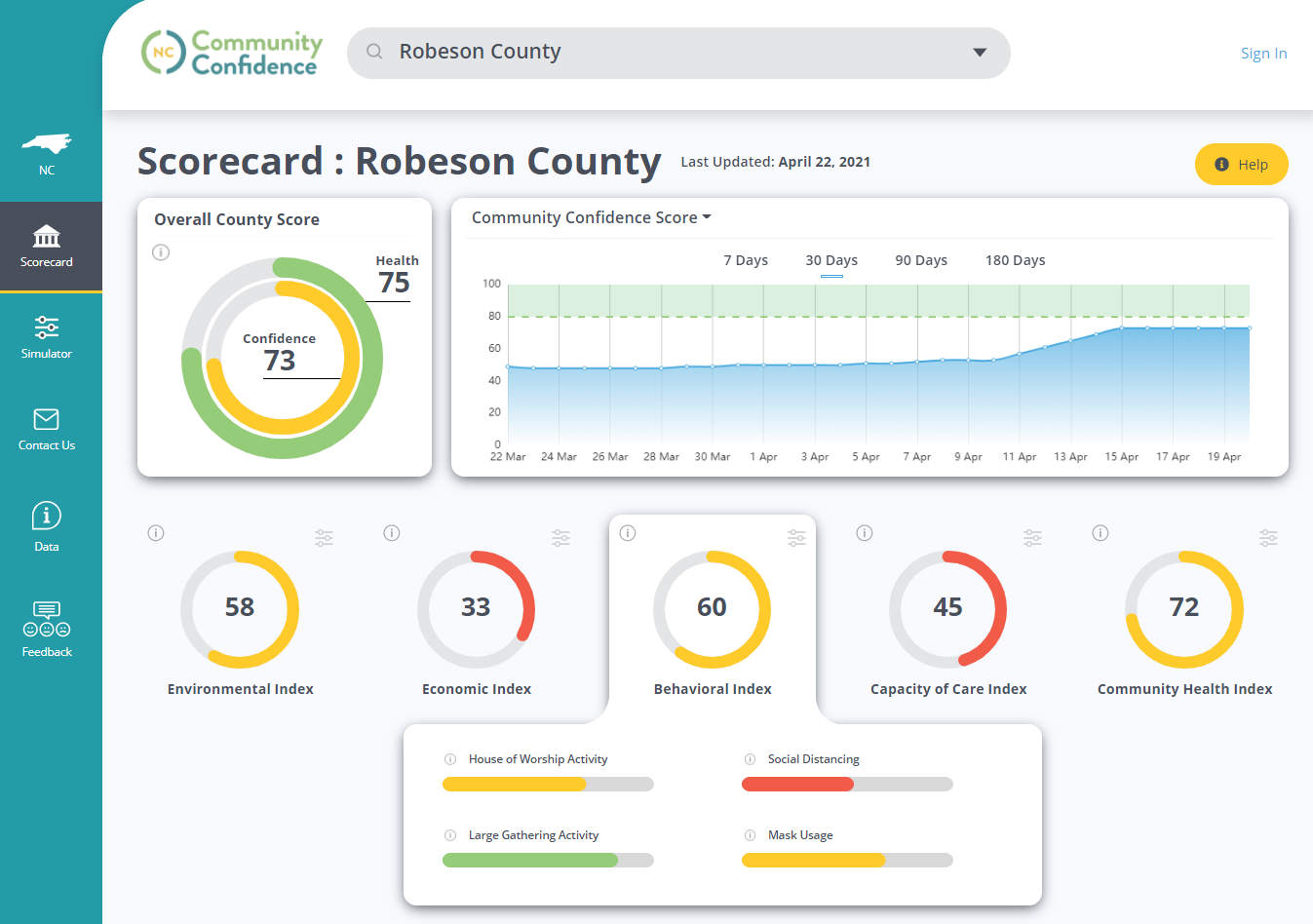
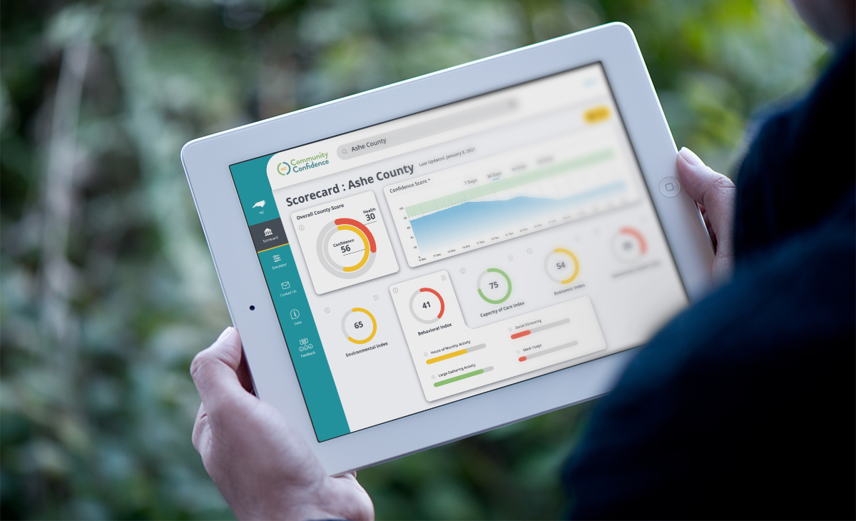
#1 – Community Confidence
https://communityconfidence.org/
Community Confidence is a decision support tool for government and business leaders to use when making important decisions that will impact their communities during the pandemic or other significant health challenges.
The platform combines actionable scientific data with community preferences to enable informed decision-making that will restore confidence.
Pros
- User-friendly, intuitive interface
- Weighs community health risk vs. economic activity
- Contains comprehensive data sources
- Delivers best-practice recommendations and simulates impact on scores
- Enables policymakers to make informed, data-driven decisions with confidence
Cons
- Currently only available for 7 pilot counties in North Carolina
Well, that’s it for our top 10 COVID dashboards. What do you think? Are there any that you liked more than others? Did you have any pros or cons that we missed? Do you know of any others that we should add to the list?
Please feel free to share your comments on this blog post in the space below with confidence…Community Confidence!
